Rajasthan Royals
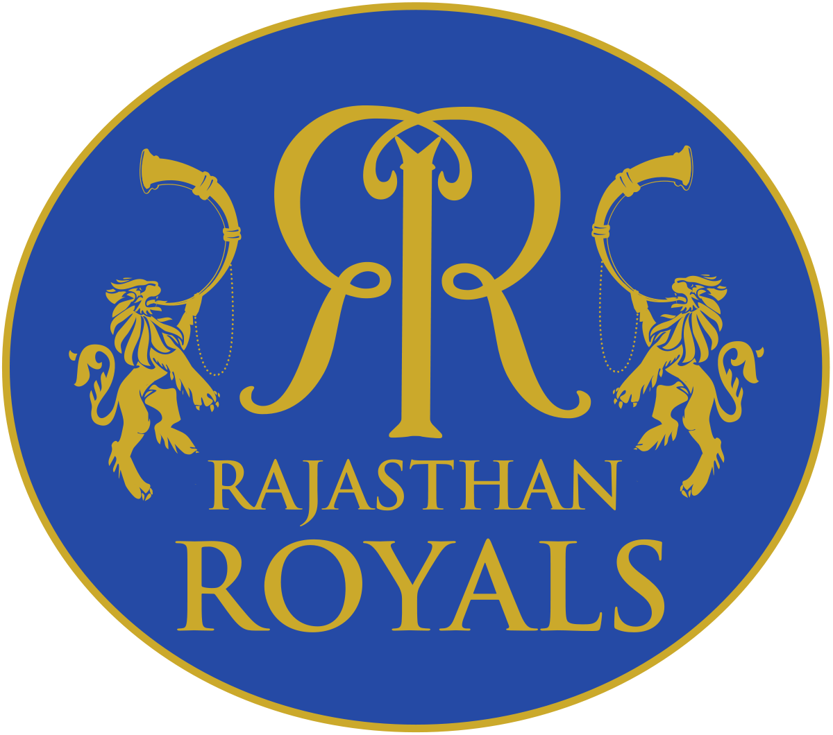
Rajasthan Royals – the name itself is suggestive of the grandeur and majesty that the land possesses. The state of kings and their impeccable forts, Rajasthan is famous for its royalty. The logo conveys the feeling.
The centerpiece is a majestic pillar that delicately balances the ‘Double R’ figure. The letter ‘R’ is drawn artistically to match the similar shape of ‘R’ written in the Devanagari script ( र ). There are two lions standing on their two limbs and playing trumpet, again the lion – the king of the jungle – represents Royalty.
Royal Challengers Bangalore
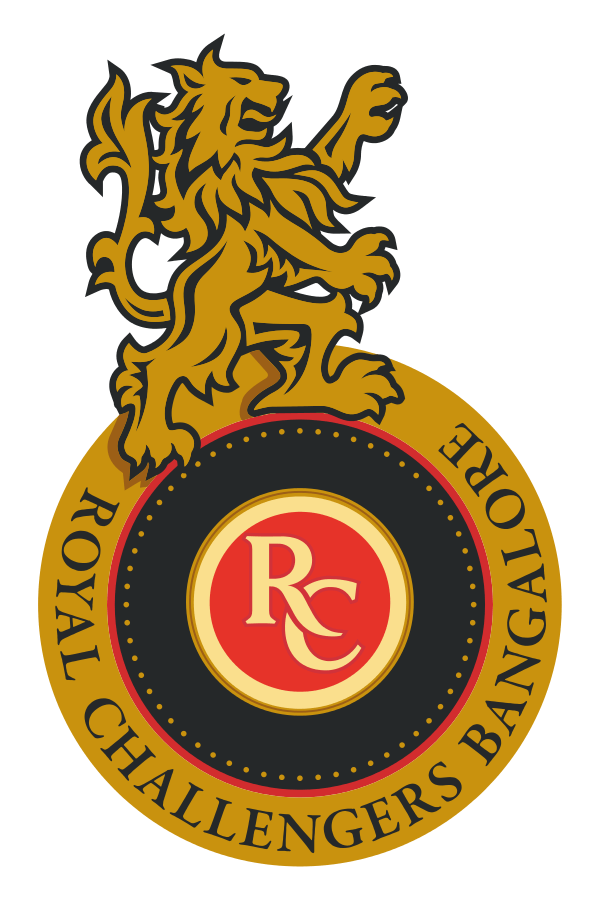
There is not much mystery behind the logo of Royal Challengers Bangalore. The logo is synonymous with the logo of the liquor brand of the owner. The lion is also a part of it and has no other significance. Interestingly the logo color theme of Red and Yellow matches that of the state of Karnataka, the region which the team represents. Two birds in one arrow, the genius of Vijay Mallya.
Sunrisers Hyderabad
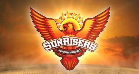
The team name is justified in the logo with the depiction of the rising sun. The team is owned by the Sun Group thus the name and depiction in the logo. Eagle is considered to be the king of the birds, he also flies high, nearest to the sun. The flying eagle here is to inspire the team to fly high and rule the world.